Monday, November 30, 2009
Real World Analogies in OBIEE
Although it is ironic that an application with the word “fantasy” in its title would be a useful analogy to solve our business problems, it is still true. Fantasy sports leagues have been very successful in the real world as an analytic tool that has had mass uptake. The application needs to be effective in helping groups to complete their assigned work, and to make better decisions, which are both key goals of our OBIEE implementations. Fantasy leagues are used as a communication vehicle for real world business groups that are looking for ways to interact, such as a college cohort looking to stay in touch after graduation, or a company contest. The value of contests as a business tool for generating ideas is well documented. Google’s programming contest, which started in 2002 has generated tens of thousands of applications, is responsible for important real-world systems like Google Local and Professor-Verifier [The Google Way, Chapter 7: Look for Ideas Where They Are, Bernard Girard, No Starch Press 2009].
The history of the fantasy leagues, more than thirty million strong today, is curiously analogous to what we want to achieve with OBIEE. From 1960 to 1980 it was a tool used by the intellectual elite, like Harvard Sociology Professor William Gamson’s “Baseball Seminar”. Rotisserie leagues started getting media attention in 1980, and special notice was given to the fact that data was used in real time, statistics from the current season. The business of statistical analysis matured in the fantasy sports field after its popularity created a demand for optimized predictions of specified Key Performance Indicators that scored points in the leagues.
Fantasy sports as a web application online is currently used by over 30 million people, creating competition for the best analytic dashboards to attract the most users.
So what do analytic dashboards used by these fantasy leagues look like, and how can we do that in OBIEE dashboards? While graphs may be important, note that for the masses these graphs are not extremely useful. Tabular lists dominate fantasy sport websites. The lists must default to the most useful Top-N and be re-sort-able by column. This is a common feature of tabular reporting in OBIEE, but it is important to understand that in the real world, other more graphic features do not undermine the importance of putting our data in this fashion on dashboards. The ability to quickly navigate from one presentation of data to another presentation of data with the same visual representation, a tabular, re-sortable presentation, is the dominant feature. Visual keys, surprisingly, are most useful when they simply give us more information on that representation. For example, ESPN has a Top-N page of multiple major categories, and the graphic is simply a photograph of the face of the top person in that category. In OBIEE, it might be useful to expose more photos of our business individuals, such as the business owner responsible for the dashboard. If it were a KPI were measured by team performance, a team logo might be useful. More sophisticated analytic tools are for a different audience, and follow the needs of the statistical analysts who are part of smaller decision teams, so they do not get exposed on the dashboards used by most of the people who consume the application. This might be an equivalent of a text alert on the screen that aggregates the number of Monte-Carlo simulations that were done, but exposing details of the thousands of simulations would not be possible.
BI Applications in 7.9.6 already have done some good work in providing a user experience. We just have to pay careful attention about how to implement the system. For example, built into the out-of-the-box experience are two sets of dashboards. The set of dashboards that is used by most people has the common presentations similar to fantasy leagues, such as the Top-N type of presentation. When you see demos of the tool, they default to the graphics, but there is a view selector that allows tabular lists of the data, and I would suggest considering in most cases whether the default presentation when coming on-screen should be tabular to reduce clicks and increase usability. The other set of dashboards spans multiple subject areas. These are pre-built statistical analyses available for when decisions need to be made upon the data, and include scatter charts, regressions and tools common to a smaller audience, the more sophisticated decision analysts.
Another question I have been asked in OBIEE implementation discussions is whether a contest for who uses the dashboards the most is possible. This would be analogous to the fantasy sports league itself. The answer is that it is very possible, in fact we do monitor usage in the OBIEE implementations, and more sophisticated applications are already developed. BIConsultingGroup’s product IMPACT gets more sophisticated reporting out of the usage of the end users. A dashboard could be designed and written with the specific intent of making a usage contest out of the usage analysis information, with the key business interactions as the key performance indicators. For a more comprehensive analytic application, the design could integrate an application similar to a fantasy league draft, where draft results for units in the sales pipeline could provide interesting information about predictions about which sales in the pipeline have the best chance of success.
What are design teams responsible for? Blogger Jeff McQuigg writes, “A BI system is a well thought out, planned and coordinated collection of efforts designed to produce a system that is so well organized it allows your user community to ask sophisticated questions of it and get those answers quickly and with a high degree of accuracy.” Fantasy leagues provide us with a successful real world analogy that we can use for building great OBIEE dashboards.
Saturday, November 28, 2009
Training Qualm
In today's market with companies saving every dollar they can hold on to, it is hard enough to justify reasonable expenses and even harder to justify things like seminars or training courses. I certainly do not have the money to spend on them. Some companies are better at others in investing in their talent pool than others, but even they typically do not send all their talent. They will rely on the person or few people to bring back that information and spread their knowledge. So why is it that these Guru's or Training Professionals do not provide more web based seminars and courses? With today's web technology it is very easy to provide professional interfaces for this sort of purpose. VoIP is mainstream which allows them to completely control registration and access to the material, and best of all it saves the registrants money, not to mention the hassle of expense reports, travel arrangements, and of course the actual travel. And with the ever increasing acceptance of a green philosophy, you can save pollution from air and car travel, waste from brochures and displays, and reduce energy and resource consumption.
Sure, there are some down sides to web based conferencing. You cannot really control how many people are viewing or listening in on the conference at the attendant's site, but again with the increase in attendance from people who cannot afford to come, this does not add much in the way of missed profits. Also, if the training is good and you are providing advertising space in the conference room, these non-paying attendees would be a benefit. Even with the technology and software we have, I have yet to see a good way for the interaction of a classroom type of atmosphere. And yes, you are not bringing any money into to the local economy or state, but if you feel that bad about it, donate a portion of the extra profits you gain from more attendees to a local charity.
All in all, most companies that provide training have come to understand this view point. They provide some sort of service to offset the travel expense whether it be "on-site," "on-the-job," or some sort of web based training. But for some reason, these email invitations to half day or one day seminars, courses, briefings, outlooks, etc. have not grasped the idea of sharing these ideas via a live web meeting. And at least in my mind, these small "meetings" should be more abundant than week long training courses.
Kimball vs. Inmon: The TDWI perspective
As it was explained to me, Kimball's "Bus Architecture" defines a data warehouse as the combination of all the data marts, which would make the data warehouse responsible for the intake, integration, distribution, delivery, and access of data. Comparatively, Inmon's "Hub and Spoke Architecture" defines the data warehouse as "a subject-oriented, integrated, non-volatile, time-variant collection of data organized to support management needs." Basically, it is responsible for the intake, integration, and distribution of the data. The argument proposed in the course was which was better to use?
To me, it seems this depends on the level of the BI program at the business in question. Is your business new to BI or finding their previous BI project poorly integrated? You could do well to subscribe to Kimball's approach, as it quickly allows the users to get what they need. However, as the BI program matures and more data marts are developed the issue of maintaining the "bus," the rules that define the conformed dimensions necessary for the architecture, become harder to keep aligned. This is where Inmon's approach makes sense, by pushing the conformity back to the warehouse, it is easier to administrate changes to rules and enforce integrity.
True, the line where it makes sense to implement the "hub" in the Inmon's architecture is hard to draw, but aside from that blurred area, I'm not sure there is much to arguing one as "better" than the other. To me it's simply a matter of BI Program Maturity.
Wednesday, November 25, 2009
BIEE and BI Publisher's integration (Best Practice tip)
- SQL Type
- OBIEE Answers, termed Oracle BI Answers
What is the difference? Let's see. If we take the route with OBIEE Answers then in BI Publisher we get immediate results without any additional work:
 For the above data set we get the following XML output:
Problem with Long Tag Names in RTF Templates
But one of the drawbacks of this approach is that we get long tag names, like for example: <_sales_facts_._amount_sold_>. These long tag names are difficult to handle in BI Publisher for RTF template development. For example, if the formula used to create the OBIEE Answer is a long CASE statement, the tag contains this long statement. This drawback is a problem because of Microsoft Word’s properties limitation. Any situation of form field is limited to 276 chars. That is 138 chars max per tab: Status Bar and Help Key (F1) ) as confirmed below:


 Workaround for the Problem with Long Tag Names in RTF Templates
But using the following workaround, we still can access BI Server and leverage all its content. Simply go to same BI Answers query ==> Advanced tab and take the “logical sql”:


Next, paste this logical sql into the data model in BI Publisher and voila, we get the same results but with the labels associated: saw_0, saw_1, … saw_5.
 At this point some work is required to mapping the saw_X columns with the corresponding ones in the BI Answers query to make the column names meaningful in our report. Renaming the columns does not present any limitations to our goal of pixel perfect reporting.
Now, if we execute the report just defined then we can see that the XML elements of the output file are shorter and can be accommodated to our taste.

Unlevel Hierarchies: a Quick Workaround
Here is a simple workaround. Let’s say there are 5 levels. Make a union query by selecting all columns and repeating it five times as a union of five queries. Then one query at a time, modify one or more of the columns to include a blank instead of the column. One query goes to level 5, one goes to level 4 with blank in level 5, one goes to 3 with blank in levels 4 and 5, one goes to 2 with blanks in levels 3, 4 and 5, and one goes to level one with blanks in levels 2, 3, 4 and 5. This when rendered will produce a hierarchical visualization of the unlevel hierarchy, with all the members visible.


I have used this at clients with much success. Since the Essbase cube had multiple hierarchies, we were able to combine this technique with putting a dashboard prompt at the top of the page where the user selects which hierarchy to view. For example, two hierarchies might be Company before Merger and Company after Merger. The selection which hierarchy to choose would be done for Level 1, and this would affect all the union by putting Is Prompted for Level 1 in the filter criteria.

Circuit 2009

This past week the Circuit conference in Washington DC was held at the beautiful Gaylord National Center. Soldiers milled around the halls the entire week, using the facility for conferences. Credit is deserved to Quest and OAUG, as well as the Real Estate SIG, for putting together a major regional conference in a downturn economy. These organizations would not have been able to make such a great convention without getting together and doing it regionally and across user groups.
Some of the best content I have heard in a long time was available at the conference. The time has come for business intelligence and social media to come to the core of enterprise applications, and Oracle is poised to capture the market demand for these features.
I spoke on Hyperion EPM Production Reporting, and there was a lot of discussion throughout the week on use of reporting in organizations. The vendors were great as well, including the JDEdwards Play Day which is very popular. I would like to focus however, on what I think is a very significant matter that was discussed in the keynote and subsequently demonstrated in the major “what’s new in the next release” presentations at the end of the week.
All of our applications are going to be changing so that the core of the experience is Business Intelligence and Social Networking centric. Better visualizations, OBIEE, Online Chatting, Comments Posting, URL linking, and Tagging are now a PeopleTools upgrade. There is no requirement to do an applications upgrade. As far as the applications themselves, Oracle will sell Fusion as a new application, or customers can choose to use Application Integration Architecture as the integration solution. These are alternate options for us to choose from, and the key theme is "whatever works best for us." The technology that has been here for many years is finally going to get the uptake it deserves, seamlessly, usable, and according to the value it represents.
This is a big takeway. The uptake of business intelligence and social media embedded in applications is going to be dramatic in the coming years. Integration partners and organizations need to look at how this uptake will be supported.
Tuesday, November 24, 2009
OpenWorld Video: Introduction to BICG IDENTITY
On October 12 during Oracle OpenWorld, Mike Jelen provided an overview of BICG IDENTITY.
BICG IDENTITY is the branding and customization service from BI Consulting Group available for Oracle Business Intelligence Enterprise Edition (OBIEE) deployments. With the use of an internally developed web-based tool called the IDENTITY Stylizer, changes to the visual look and feel of the OBIEE interface can be altered to reflect your organizational branding.
Check out this presentation which features some real-life implementation examples of IDENTITY.
Friday, November 20, 2009
The Impact of IFRS for EPM Reporting – Part 2
Previously, I gave a brief overview of IFRS and it’s potential impact to many organizations. In that summary I provided a list of major differences between IFRS and US GAAP, the first item in that list was Financial Statement Presentation. I want to provide some more detail about each item in the list as well as provide some references for anyone wanting to learn more about the changes driving financial reporting.
So, let’s talk about Financial Statement Presentation. Below are the similarities and differences between IFRS and US GAAP.
Similarities
- Balance sheet, income statement, statement of cash flows, footnotes
- Accrual basis
- Similar materiality and consistency concepts
Differences
Classification of expenses
- US GAAP – based on function (e.g., cost of sales, administrative)
- IFRS – based on function or nature (e.g.., salaries, depreciation)
Layout of balance sheet and income statement
- US GAAP – Public companies must follow Regulation S-X
- IFRS – IAS 1 prescribes a list of minimum items – less prescriptive than S-X
Extraordinary items
- US GAAP – restricted to items that are both unusual and infrequent
- IFRS - prohibited
Some additional information about Financial Statement Presentation
In addition to the IFRS changes, the FASB and IASB have started considering other alternative reporting guidelines that may be incorporated into the IFRS standard in the future.
Some of the alternatives that are being discussed are significantly different than current reporting under both IFRS and US GAAP. This potential change in reporting presentation was brought to my attention by an actual client and they are already discussing the impact and requirements to fulfill the new guidelines.
The partial information below is from a publication by KPMG’s Department of Professional Practice – Audit, October 2008, Defining Issues, No. 08-42:
The FASB and IASB favor significant changes in the structure and content of the basic financial statements, and have set out their preliminary views on those changes. If the preliminary views go forward during the remaining due-process steps, the statement of financial position would no longer be organized primarily by assets, liabilities, and equity, and the income statement would no longer be organized primarily by revenues and expenses. Instead, the information in the statements of financial position, comprehensive income, and cash flows would be organized under “business,” “financing,” “income taxes,” “discontinued operations,” and “equity,” the latter not included in the statement of comprehensive income. Information would be disaggregated more than is the case today, and a new schedule would reconcile the information in the statement of cash flows to the information in the statement of comprehensive income.
…
The presentation model would have each entity present information in “sections” grouped by these major activities: business, financing, income taxes, discontinued operations, and equity. The model gives the business and financing sections subordinate reporting “categories.” Business-activities information would be separately presented for the operating- and investing-activities categories, and financing-activities information would be separately presented for financing assets and financing liabilities.
The classification scheme for financial statements is illustrated in Table 1

If you would like to read more about this subject the full KMPG article is located at the link below:
http://www.us.kpmg.com/RutUS_prod/Documents/9/DI_08_43_SEC_Mark_to_Market_Study.pdf
None of these decisions are final yet, but these are some of the things that we need to keep in mind for the future of EPM and BI.
Wednesday, November 18, 2009
BI Publisher's Timestamp and Date
In the process of getting the final output, every rtf template goes into different temporary files:
When the template RTF file is converted into XSL-FO BI Publisher’s parsers include several default parameters at run time and one of them is :
By default, this parameter will determine the timestamp based on Greenwich Median Time.
One way we can adjust this value in our RTF template is in the following way:
Where:
sysdate_as_xsdformat() : This function will generate the server’s timestamp
format-date:xdoxslt: This function will format the time & date value using the mask and the Timezone provided.
The output obtained is similar to:
When the server is located in New York (EST) then its timestamp is like: Fri 20 Nov 2009, 00:47:50.
As indicated above if the timezone is omitted (i.e PST, EST, etc) then GMT will be used and the output would have been:
You can find a good example on formatting date values in this link:
http://www.oracle.com/technology/products/xml-publisher/demoshelf/viewlets/TemplateBuilder-FormatDates.html
And the corresponding documentation on date formatting here:
http://download.oracle.com/docs/cd/E12844_01/doc/bip.1013/e12187/T421739T481157.htm#4535403
Tuesday, November 17, 2009
OpenWorld Video: Introduction to Oracle Exadata
On October 12 during Oracle OpenWorld, Lisa LeFort provided an overview of Oracle's highly-scalable hardware solution for accelerating the performance of large data warehouses. LeFort examines how Exadata improves query performance by 1000% or more through dramatically increased bandwidth and the advanced algorithms of SmartScan technology. Check out this profile of the fastest database machine in the world.
Friday, November 13, 2009
The Impact of IFRS for EPM Reporting – Part 1
The question isn’t if the US will adopt new IFRS accounting standards, it is when.
Brief Summary of IFRS
The SEC is reviewing a combination of IFRS and U.S. GAAP to produce a common global standard for reporting financial data. Across the globe many companies in hundreds of countries have successfully adopted IFRS, and by 2012 every major capital market is scheduled to have adopted IFRS, except the United States. The challenge for many companies is that global investors are interested in a single set of financial statements and measures that are consistent across borders and languages. The current expectation for the United States is to adopt IFRS by 2014 two years behind the rest of the world.
Challenges
Here are some of the challenges of transitioning to IFRS for U.S. GAAP companies:
- Sourcing the right information
- New data required by IFRS
- New accounting definitions
- New valuations for balance sheet and income statement lines
- More detailed overseas operations’ reporting
- More detailed segment reporting
- Increased disclosure obligations
- Standardized data definitions across the organization
- Preventive and detective controls
- Reduced reliance on spreadsheets to support the collection, consolidation, and reporting of information
- Conversion of historical data for comparability and trending
In addition, during the process of converting to IFRS there will be an interim phase in which IFRS and local GAAP requirements will be required. Therefore, public companies would be required to maintain multiple reporting methodologies until IFRS becomes fully adopted.
Potential changes for Employees and Operations
Corporate culture has long conformed to the necessities of US GAAP, with more than just financial reporting being impacted. The first example is sales strategies, although companies might not have explicitly designed their sales processes around US GAAP requirements, many compensate their sales staff based on revenue recorded or product shipped, essentially designing their sales commission program around financial reporting considerations. The new IFRS reporting requirements could change all that. Second, businesses may also decide to restructure their compensation structures, especially if compensation is equity-based or driven by performance. These are just a couple of the changes for employees to consider when transitioning to IFRS.
In addition to employees, the operations of an organization may need to change as companies begin to adopt the new reporting standard throughout the business; some examples are the data sources and data repositories. There may be a need for new processes control, new treasury strategies and additional IT infrastructure changes to facilitate new systems or upgrades. All these items will drive companies to enhance resources by hiring new personnel or begin retraining in- house staff. So, planning for these changes becomes a crucial part of the operation of a company during the transition to IFRS
Major differences between IFRS and US GAAP:
- Financial Statement Presentation
- Consolidations, Joint Venture Accounting, and Equity Method Investees
- Business Combinations
- Inventory
- Intangible assets
- Long-lived assets
- Impairment of assets
- Leases
- Financial Instruments
- Foreign Currency Matters
- Income Taxes
- Provisions and contingencies
- Revenue Recognition
- Share-based payments
- Research & Development
- Employee benefits other than share-based payments
- Segment reporting
- Earnings per Share
- Interim Financial Reporting
- Subsequent Events
- Related Parties
In the future I’ll provide additional detail regarding each difference to help us understand the changes and how they relate to the EPM environment.
Thursday, November 12, 2009
Different Options for Loading Data to Planning
For existing planning users, the old standby for loading data to planning was through the use of the Hyperion Application Link (HAL) utility. However, this utility has been phased out and is no longer supported by Oracle for use with Planning, therefore customers who are on older version of planning and want to upgrade face a brand new question: What is the HAL replacement? In most cases Oracle Data Integrator is the replacement tool for HAL, however, there are situations when a different tool is a better fit.
For new planning implementations the answer is a little more difficult due to the number of options available for loading data to planning.
There are multiple tools that are capable of loading data to planning. Each tool has its own pros and cons in regards to loading data to planning. The options for loading data into Planning are:
- Oracle Data Integrator (ODI)
- Data Integration Manager (DIM)
- Financial Data Quality Management (FDM)
- Enterprise Performance Management Architect (EPMA)
- Spreadsheet lock and send
I have worked with each of the tools listed and found that there is a lot of overlap in the tool choices so I decided to provide a brief description of the tool along with the strengths and weaknesses that I have found.
Oracle Data Integrator (ODI)
Oracle Data Integrator Enterprise Edition is a comprehensive data integration platform that covers all data integration requirements from high-volume, high-performance batches, to event-driven, trickle-feed integration processes, to SOA-enabled data services
Strengths
- High performance, E-LT architecture
- Does not require new servers/hardware; scales with existing source and target hardware
- Bundled with Hyperion Planning - No Extra Cost
- Oracle Strategic Tool for Data Integration
- Works with data and meta data
Weaknesses
- Usually IT Managed. There is a web application to enable business users to execute routines as needed.
- Hyperion Knowledge modules 1.0 release
- Not fully integrated with all Hyperion Products
- Smaller resource pool to pull from
Data Integration Manager (DIM)
Strengths
- Full scale ETL tool
- Flexible and Powerful
- Time proven track record for ETL excellence
- Based on Informatica - Lots of experience in Marketplace
- Works with data and meta data
Weaknesses
- IT Managed
- Additional Licensing Required
- Additional hardware required (unless PowerCenter already exists)
Financial Data Quality Management (FDM)
Strengths
- Provides Business Mapping Layer
- Provides Drill back to transactional detail
- Provides drill through to select ERP systems
- Business Managed
- Auditable
Weaknesses
- Does not handle complex transformation
- Limited Functionality
- Very limited source and target capabilities
- Limited Automation capabilities
- Additional Licensing Required
- Only works with data
Enterprise Performance Management Architect (EPMA)
Strengths
- Manages meta data
- Allows for data sharing between applications
- Not a direct to source system - still requires data process to get data directly from data source
- Very limited source and target capabilities
- Limited automation capabilities
So the big question is which tool do I use. I mentioned earlier that it depends. Each tool will load data to planning but each tool has its strengths and weaknesses. When determining which tool is the right tool to choose, I consider the below questions.
- What is the license enablement
- Types of Data Sources – Flat files or direct database connections
- Level of Automation Required for the load process
- Data mapping requirements
- Does the load process require auditing capabilities
- Who will own the data load process - IT or Business Analysts
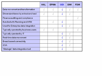
This will give you a start in selecting the right tool. Each tool has its own set of integration options so I have summarized the tools and the data load options in the below chart to help determine which tool is the right tool to use.
I usually lead with Oracle Data Integrator in new environment architecture and in most cases use ODI as the tool for loading data into planning. However, FDM does fit in many environments where there is less IT involvement and business will manage the entire load process. FDM is also the only tool that provides drill through from planning to transactional detail or to the ERP system. DIM is a great alternative if you have in house Informatica expertise and you don’t mind spending the extra licensing costs to enable DIM.
Wednesday, November 11, 2009
Using Smart View with OBIEE - Part 2
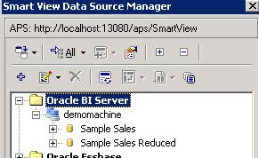 After completing Part 1, You should have:
- Accessed Smart View
- Connected Successfully to your OBI Server
- Have your data source manager set-up similar to this screenshot
Create a Smart Slice
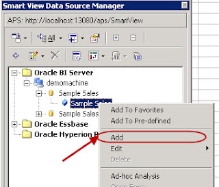 Expand the "Sample Sales" schema.
Create a Smart Slice
Select "Add"
(This will start the Smart Slice creation process)
Once your “Add” selection has been made the open worksheet is modified with a rows/columns intersection and a Smart Slice POV prompt. This is the Smart Slice creation mode where you define your analysis criteria and will eventually save it for later use. Notice that the row and column members are at a high-level. At this point we need to select a more granular set of data for analysis.
In the POV prompt (see image below) we are able to select the members that actually build out the grid rows and columns as well as the POV for which no members are actually shown on the grid but are integral to the data slice that we want to conduct our analysis with. When we are ready to select this criteria simply double click on a member. Also to move a member from POV or from rows to columns, simply select the member then drag and drop it into the desired location.
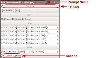
Move DESCENDANTS([D0 Time].[T03 Per Name Qtr]) from under the POV header in the POV prompt so that it rests under the Rows header. Now move [D0 Time].[T00 Calendar Date] from underneath the Rows header so that it rests under the POV header.
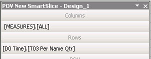
Under the Fields header of the POV prompt, find [D1 Customer].[C1 Cust Name] and select it. Now drag the [D1 Customer].[C1 Cust Name] from underneath the Fields header so that it rests underneath the Rows header.
At this point the very structure of our sample Smart Slice example has been created. However, as you can see from the worksheet rows and columns, the current selections are seeking to retrieve the DESCENDANTS of our tabular grid, this would be a huge retrieval of data and we do not want that. We want to build out a more granular slice of data and we do that by conducting the following operations all by using the POV prompt.
Double-click [Measures].[All] under Columns in the POV prompt.
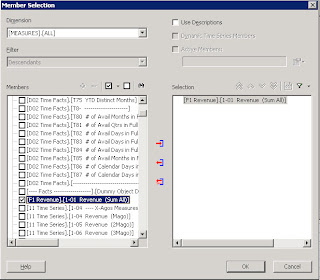
Select the following measure [F1 Revenue].[1-01 Revenue (Sum All)] by using a combination of the checkboxes and the arrows in the middle of the two large pick-list columns.
Double-click [D1 Customer].[C1 Cust Name] under the Rows POV prompt.
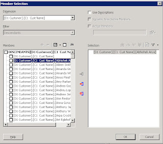
Select the following measur [D1 Customer].[C1 Cust Name].[Abhishek Arya] by using a combination of the checkboxes and the arrows in the middle of the two large pick-list columns.
Double-click [D0 Time].[T03 Per Name Qtr] under the Rows header in the POV prompt.
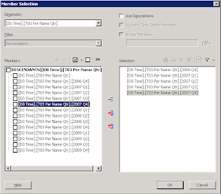
Select the following measures [D0 Time].[T03 Per Name Qtr].[2006 Q4], [2007 Q1], [2007 Q2], [2007 Q3], [2007 Q4] by using a combination of the checkboxes and the arrows in the middle of the two large pick-list columns.
Your final grid should appear as follows.

Right now, the Smart Slice you have been modeled but not confirmed. To begin saving the Smart Slice, click the green arrow toward the bottom-left of the POV prompt.
You may be prompted to review the Member Selections made. If so, just click the “OK” button.
Next, the Smart View Data Source Manager will open a field which allows you to enter a name for the Smart Slice you have just created. Enter a “TestSmartSlice” (1) in the field then click the green (yin-yang-like) arrows (2) to save it.
After the Smart Slice has been saved, it is immediately visible in the tree.
Right-click on the smart slice you’ve just created and select “Insert Query Into Report”
The Report Designer appears. Click the Insert button and select Function Grid.
A tabular representation of the model you built out for the smart slice now appears. The #NEED_REFERESH value underneath the measures column tells us that we need to hit the REFRESH button in order to run the query to get data. We do this by using the Hyperion file menu dropdown and selecting Refresh.
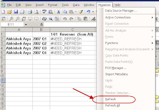
The results of the retrieval are shown in the worksheet and we have successfully retrieved data from the Oracle BI Server using SmartView and a Smart Slice.
Conslusion
This example is very basic but it introduces you to the concept of conducting analysis of your Oracle BI data outside of Answers. Using smart slices allows reusable analysis to be conducted in the most popular analysis tool on the market, MS Excel. Using smart slices also introduces a new level of security that can be achieved for your subordinate users. Using SmartView as an extension of current analysis tools will allow you and your organization to grow your toolset along with the direction that Oracle is going with in Business Intelligence following the Fusion release.

