Showing posts with label dashboards. Show all posts

Tuesday, November 9, 2010

Dashboard Design Tips

When designing a set of dashboards, I like to include an “at-a-glance” or summary page as the first dashboard a user sees when they log on each day. This page should include a condensed version of the user’s key performance indicators as well as any generated alerts. Users should then have the option of drilling down or to additional detailed reporting. In order to encourage usage of the dashboards, embed your dashboards as a link within the corporate portal so users have one click access to the information

Consider the page placement of your key performing metrics based on web page eye movement. The diagram below shows how the human eye views a web page, based on level of priority. Place the most important elements for viewing in the upper left hand corner and the least important in the lower right corner to mimic the way the eye scans a page.

Some additional design guidelines are:

  • Ideally, the dashboard should fit on one page. Try to avoid any scrolling from left to right.
  • The best screen size for the dashboard window is 1024 x 768.

  • The ability to drill is critical to the success of your dashboards. Users need to know that the underlying data is going to be available to them. Some projects I’ve worked on have been very successful when allowing the users to drill not only to the detailed data but also back to the source transactional systems.
  • Introduce competition by using Top 10 reports, conditional formatting, etc.
  • Avoid decorative dashboard elements cluttering the screen like dials, gauges, excessive colors and images. Your dashboard can still be visually interesting while following standards.
  • Speaking of standards, it’s important that dashboard standards and best practices be defined early in the design process. This ensures consistency among various groups within your organization. I recently worked on a project where OBIEE had been in place for over a year, being used by a few departments. Additional teams were being brought on board and new development had already started. There were no design guidelines in place and the new dashboards were completely different among each of the teams. One of our exercises was to look at what was in production today and identify standards to be used in future development. This also caused a little rework on the production dashboards to meet the requirements of all teams, resulting in a consistent approach for the organization as a whole.

As a little bonus, I’ve included a few tips from Dashboard expert Stephen Few:

Characteristics of A Well-Designed Dashboard

  • Exceptionally Well Organized
  • Condensed, Primarily in the form or Summaries and Exceptions
  • Specific to and Customized for the Dashboard’s Audience and Objectives
  • Displayed Using Concise and Other Small Media that Communicates the Data and Its Messages in the Clearest and Most Direct Way Possible

Common Mistakes in Dashboard Design

  • Exceeding the Boundaries of a Single Screen
  • Supplying Inadequate Context for the Data
  • Displaying Excessive Detail or Precision
  • Arranging the Data Poorly
  • Highlighting Important Data Ineffectively or Not at All
  • Cluttering the Display with Useless Decoration
  • Misusing or Overusing Color
  • Designing an Unattractive Visual Display

Friday, March 26, 2010

Which Tool Should Be Used for Reporting?

My clients often wonder which Oracle tool they should use for reporting, building graphs, and generating dashboards. It’s a great question because, as anyone in this realm knows, there are many different options. This blog will touch on the three reporting tools I’m familiar with: Financial Reporting Studio (FRS), Web Analysis (WA), and Oracle Business Intelligence Answers (OBI).

One caveat here is that the bulk of my experience comes from the Oracle Hyperion side, so I have much more familiarity with FRS and WA, and definitely less so with OBI. So, this blog will be written from that perspective.

Below, I’ll give a synopsis of what each tool does, based on my experience, followed by my opinion of when each should be used.

Financial Reporting Studio
FRS is a great tool for producing regular reports, like a monthly reporting package. It allows you to create production level reports with a multitude of formatting options. FRS reports can be viewed in PDF or HTML format, from a client component or over the web. Reports can be gathered together in Books and batch scheduled to run at the frequency of your choosing, and then saved to a particular location or emailed out to a list of users.

FRS is not a tool for producing dashboards, is limited in its chart and graph functionality, and would not generally be used for ad-hoc reporting.

Web Analysis
WA comes from the Hyperion suite of products as the tool for building dashboards. In my experience, it’s most often used to create quick snapshots of data for management or executive level users. WA allows you to create multi-view looks at your critical business metrics, either in graphical or grid format. For example, a dashboard might include a line graph of sales by region in one quadrant, a bar chart of sales by VP in another quadrant, a pie chart of expenses by category, and a grid showing spending by department. WA includes traffic lighting as a feature, allowing you to highlight or color significant variances of data.

WA would not be used for production reporting.

Oracle BI Answers
OBI Answers is a tool for building both reports and dashboards from a variety of sources including relational and multi-dimensional databases. You can build similar dashboards to what WA offers and publish reports similar to what FRS offers. The entire OBI suite has pre-built modules by industry that allow for easier implementation depending on the particular business case.

While OBI Answers can use Oracle Essbase as a data source, there are some issues in doing so that prohibit the use when a particular hierarchy exists. This should be addressed in an upcoming release, but at this point, the OBI link to the Oracle Hyperion suite of products is very limited.

Which Tool?
So, which reporting tool should be used when? With the current releases and functionality available, here is how I would use them:

FRS – Use for regular production reporting such as income statements, operating expenses, headcount, and any other meaningful financial metrics from an Oracle Hyperion data source such as Essbase, Planning, or Financial Management. I generally don’t create charts and graphs using FRS because the options and functionality are fairly limited. But, if you have fairly straightforward and simple chart requirements, then FRS should work fine for you.

WA – I would use Web Analysis for producing grid and chart dashboards from an Oracle Hyperion data source. WA does a good job of incorporating “bells and whistles” that make a dashboard “pop”, providing important metrics quickly.

OBI Answers – OBI is a great tool to use to quickly build reports and dashboards from a data warehouse. In my opinion, this is the easiest tool to learn and use of the three. As I mentioned above, I don’t think it’s currently the right tool to use with Oracle Hyperion data sources, but that very well could change in the near future.

Going Forward
In future releases, I think that OBI will become the tool of choice for reporting and dashboarding, even for Oracle Hyperion data sources. Oracle is very good at creating synergies between their product lines, and while each individual application generally has their own set of tools, eventually, they converge to similar toolset technologies. I think as OBI gets more integrated with the Oracle Hyperion suite of products, it will become the tool of choice for reporting. In my opinion, it is easier to both learn and use compared to both Financial Reporting Studio and Web Analysis.

Monday, November 30, 2009

Real World Analogies in OBIEE

As OBIEE emerges as a cornerstone part of Oracle’s Web 2.0 Fusion offering, it is a good time to discuss a real world analogy that has been apparent to me for many years now and has generated excitement during planning sessions of the more innovative implementation teams I’ve been on. OBIEE is an excellent web tool, for its dashboards and navigations, and it is important to look at User Groups as a cohort of individuals with shared goals who need to use OBIEE as a communications tool and as an effective analytic tool. A tool that has been useful in the real world for doing this is the fantasy sports league application, and it gives us many valuable insights for achieving uptake in our OBIEE implementations.

Although it is ironic that an application with the word “fantasy” in its title would be a useful analogy to solve our business problems, it is still true. Fantasy sports leagues have been very successful in the real world as an analytic tool that has had mass uptake. The application needs to be effective in helping groups to complete their assigned work, and to make better decisions, which are both key goals of our OBIEE implementations. Fantasy leagues are used as a communication vehicle for real world business groups that are looking for ways to interact, such as a college cohort looking to stay in touch after graduation, or a company contest. The value of contests as a business tool for generating ideas is well documented. Google’s programming contest, which started in 2002 has generated tens of thousands of applications, is responsible for important real-world systems like Google Local and Professor-Verifier [The Google Way, Chapter 7: Look for Ideas Where They Are, Bernard Girard, No Starch Press 2009].

The history of the fantasy leagues, more than thirty million strong today, is curiously analogous to what we want to achieve with OBIEE. From 1960 to 1980 it was a tool used by the intellectual elite, like Harvard Sociology Professor William Gamson’s “Baseball Seminar”. Rotisserie leagues started getting media attention in 1980, and special notice was given to the fact that data was used in real time, statistics from the current season. The business of statistical analysis matured in the fantasy sports field after its popularity created a demand for optimized predictions of specified Key Performance Indicators that scored points in the leagues.

Fantasy sports as a web application online is currently used by over 30 million people, creating competition for the best analytic dashboards to attract the most users.

So what do analytic dashboards used by these fantasy leagues look like, and how can we do that in OBIEE dashboards? While graphs may be important, note that for the masses these graphs are not extremely useful. Tabular lists dominate fantasy sport websites. The lists must default to the most useful Top-N and be re-sort-able by column. This is a common feature of tabular reporting in OBIEE, but it is important to understand that in the real world, other more graphic features do not undermine the importance of putting our data in this fashion on dashboards. The ability to quickly navigate from one presentation of data to another presentation of data with the same visual representation, a tabular, re-sortable presentation, is the dominant feature. Visual keys, surprisingly, are most useful when they simply give us more information on that representation. For example, ESPN has a Top-N page of multiple major categories, and the graphic is simply a photograph of the face of the top person in that category. In OBIEE, it might be useful to expose more photos of our business individuals, such as the business owner responsible for the dashboard. If it were a KPI were measured by team performance, a team logo might be useful. More sophisticated analytic tools are for a different audience, and follow the needs of the statistical analysts who are part of smaller decision teams, so they do not get exposed on the dashboards used by most of the people who consume the application. This might be an equivalent of a text alert on the screen that aggregates the number of Monte-Carlo simulations that were done, but exposing details of the thousands of simulations would not be possible.

BI Applications in 7.9.6 already have done some good work in providing a user experience. We just have to pay careful attention about how to implement the system. For example, built into the out-of-the-box experience are two sets of dashboards. The set of dashboards that is used by most people has the common presentations similar to fantasy leagues, such as the Top-N type of presentation. When you see demos of the tool, they default to the graphics, but there is a view selector that allows tabular lists of the data, and I would suggest considering in most cases whether the default presentation when coming on-screen should be tabular to reduce clicks and increase usability. The other set of dashboards spans multiple subject areas. These are pre-built statistical analyses available for when decisions need to be made upon the data, and include scatter charts, regressions and tools common to a smaller audience, the more sophisticated decision analysts.

Another question I have been asked in OBIEE implementation discussions is whether a contest for who uses the dashboards the most is possible. This would be analogous to the fantasy sports league itself. The answer is that it is very possible, in fact we do monitor usage in the OBIEE implementations, and more sophisticated applications are already developed. BIConsultingGroup’s product IMPACT gets more sophisticated reporting out of the usage of the end users. A dashboard could be designed and written with the specific intent of making a usage contest out of the usage analysis information, with the key business interactions as the key performance indicators. For a more comprehensive analytic application, the design could integrate an application similar to a fantasy league draft, where draft results for units in the sales pipeline could provide interesting information about predictions about which sales in the pipeline have the best chance of success.

What are design teams responsible for? Blogger Jeff McQuigg writes, “A BI system is a well thought out, planned and coordinated collection of efforts designed to produce a system that is so well organized it allows your user community to ask sophisticated questions of it and get those answers quickly and with a high degree of accuracy.” Fantasy leagues provide us with a successful real world analogy that we can use for building great OBIEE dashboards.

Wednesday, August 5, 2009

Unlocking the hidden meaning...

How often have you come across, or been directed to a specific dashboard request, but you really have no clue what you’re supposed to get out of it? Perhaps it’s a bad design...or maybe it just needs a little explanation.

Ideally, the developer of that report should have included some kind of description. Or, if you’re the developer, you should also include something to give the end user a little direction if it’s needed.

The Problem is that no one wants to crowd valuable screen space with text that may or may not be valuable to everyone. If there was only a way to include a hover-over description… well, there is.

Here is a very simple way to utilize HTML in a Narrative View to provide you with a discrete, hover over description.

1. In your request, add a Narrative View.

2. Edit view as follows: Check the box “Contains HTML Markup”, enter 1 for “Rows to Display”, and add the following text to the Narrative box:(*Note: enter your description in place of the words, Enter Description Here)


3. In the Compound Layout, move the Narrative view to the top, click on the Format View icon, and set the Horizontal Alignment to “Left”.


The result is a [?] symbol at the top left of your request, that the user simply needs to hover-over to see the description you’ve entered.

Tuesday, July 28, 2009

High Level OBIEE report design strategy

So often an organization will take on the task of installing OBIEE, establishing the infrastructure to support it, and even re-organizing their data appropriately. But when it comes to the actual report design, standards fail to be established, reports and dashboards become awkward and cumbersome, and user adoption suffers.

Since OBIEE is often seen as an Ad-Hoc reporting tool, this problem can often be the result of many developers developing with an Ad-Hoc mentality. The result is mismatched dashboards and confusing layouts. Other times, it’s the result of too many people involved in the development process. Once something gets approved by 15 people in a Power Point mock up, it’s difficult to get changes approved when something doesn’t pan out as expected. As a result, the small imperfections get set aside, but never fail to add up.

The following is a high level list of items to keep in mind when entering the report development stage of any OBIEE project. Keeping each of these items in mind will help you design attractive and useful reports and dashboards, which will ultimately lead to greater user adoption and pervasive use of the tool.


1. Trust your users - If your users don’t use your BI or other technology systems, it’s because they either get no value from it, or the system is too slow. These same users will spend their evenings shopping online and paying bills over the internet. It’s ignorant to believe they can’t use a well designed online reporting tool.

2. Think Insight, not Reports - Take the time to understand what the business user searches for, what they mark up with a yellow highlighter, and what they look at next after discovering an “exception”

3. Move Business Skills into your IT shop, not IT skills into your Business – Make an effort to understand the business needs, and then apply the technology accordingly. Don’t ask the business to “make due” with what IT provides.

4. Design your Dashboard in OBI EE itself using an iterative methodology – Don’t use Power Point to design your reports. Designing directly in OBIEE allows you to know immediately what will and will not work. Plan to make a series of adjustments throughout the design process, using feedback from the business users.

5. Establish a set of standards – If your users can’t derive insight in the first few seconds of looking at a Dashboard, it’s a bad design. This is no longer a world in which IT programmers lead the user’s impression of standards. Amazon, Google, Yahoo!, Apple iPhones, etc. all lead the pack when it comes to quality interfaces and standardized interfaces.

Thursday, July 2, 2009

BI Publisher and OBIEE: Integration with Dashboards & Prompts

In this post I will demonstrate another way to "integrate" OBIEE with BI Publisher ("BIP"): adding a pre-built BIP report to a Dashboard and configuring it to interact with a Dashboard Prompt.

For this example I've already logged into BIP as "Administrator" and created a report named "BI Publisher Subject Area" including some simple dimensions and facts from the "Paint Exec" demo Subject Area. I've uploaded a simple table template aptly named "SubjectAreaTable" using Word to this report. The resulting report viewed in HTML looks like this:


Step 1: Add a BIP Report to Dashboard

From a blank Dashboard page, drag & drop "BI Publisher Report" object into the blank Column. Click "Properties" then "Browse" to the location of the existing BIP report "BI Publisher Request." (Note what happens when you "hover" over the report name - that's the value of the report's Description field.)


Click on the report name and then OK. Click OK again in the Properties window (accept the default parameters for now). Save your changes then view the new Dashboard. Note that the standard BIP controls are available - you can select a Template & format and even choose to deliver the output using the standard BIP options (which are a bit different from OBIEE's options).


Step 2: Configure the BIP Report to respond to a Parameter for "Region"

Now switch to BI Publisher (More Products > BI Publisher). Navigate to "My Folders," then click the "Edit" link under the "BI Publisher Request" report.


Click the "Parameters" option in the left-hand nav, then click "New" to create a new parameters.


Fill in the values as follows:

Identifier: "REGION_NAME"

This value is fairly arbitrary, but as you will see below we will be referencing it in Answers so it doesn't hurt to consider some sort of naming convention. I am also deliberately making the identifier different than the name of the Presentation Column in Answers to clarify the distinction between the two.

Data type: "String"

I've had spotty results using anything but "String" -- Date in particular gave me trouble.

Parameter type: "Text"

There are some interesting uses for other types, but we'll save that discussion for later.

Display Label: "Region Name"

This value can also be arbitrary

Text Field Size: [leave blank]
Options: [leave blank]

Both of these are also out of scope for this discussion.


Now we click into the Data Set (within the Data Model "folder") and add the line "WHERE Markets.Region = :REGION_NAME" to the SQL Query input box. Note we are using the "Identifier" of the Parameter we just created.


Save your changes (click the disk icon in the upper LH corner) and view the results - Note the results by default will be blank because we haven't entered a value. Enter "CENTRAL REGION" in the parameter box and click "View."


Step 3: Add a Prompt to your dashboard

Go back to Answers and create a new Dashboard Prompt based on the "Region" Presentation Column. Here's the important part: Configure the prompt to set a Presentation Variable named - you guessed it - "REGION_NAME" and save your new prompt.


OK last step: Still in Answers, go back to modify your Dashboard and add the new prompt. Might as well put it on top of the existing BI Publisher report.


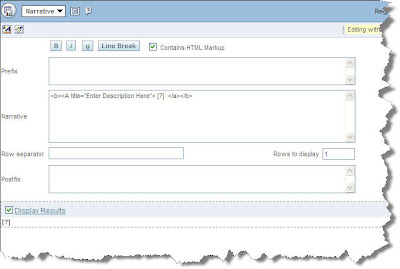
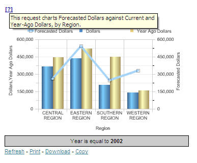
Save your changes and view the Dashboard. Again, because the default value for Region is blank, you won't get any results unless you pick one from your new prompt.


But, uh oh, how can I select ALL regions? The "All Choices" selection doesn't seem to work the same way with BI Publisher as it does with native OBIEE reports...

Hmm. How about I give a banana to whomever can chime in with the solution to THAT problem?


Remember that reports in BI Publisher can be created against other data sources besides OBIEE... but the Dashboard integration is essentially the same. I'll save that topic for another post.

TTFN

Monday, June 29, 2009

Hidden Dashboard Tips

We tend to get comfortable building OBIEE applications in a certain way.

If you have some free time, you might want to try out some of the options on the dashboard builder.

Guided Navigation in a Section and Arrange Horizontally may come in handy for instance.


There have been times when I felt that the dashboard editor allowed for too much whitespace between sections.

This got me thinking so I started exploring some options.

I had never used arrange horizontally so I thought I would give it a try.

Here is a sample of a dashboard with some embedded content and an OBIEE answers compound view in another section and column.


So if you take a look at the first column where we have the embedded URLs, you might want to slide out the video section and place it between the report and the Google search.

Notice how it swings the video right beside the embedded browser with very little whitespace.

This will certainly come in handy when formatting your dashboards for the widescreen monitors.

Next is the Guided Navigation choice at the section level. You can have entire dashboard sections appear and disappear depending on the results of an answers request. It works just like a Guided Navigation Link, only at the section level.

Take a look.

The following setting will SHOW the entire dashboard SECTION only if the request comes up empty. This allows you to show a section only when something is missing in the data. This technique can be used as an alerting mechanism.

Sometimes it pays off to explore options within the OBIEE suite if you can find a little extra time or if you are just plain curious ! I know there are some other handy little morsels splashed about in this software. If you find one, please share it with us.

Wednesday, December 10, 2008

Dashboard Navigation Tips

Some common designs for Dashboard navigation include:
  1. Spreading content across Dashboard pages and letting the user navigate to each page
  2. Linking Dashboards to specific reports
  3. Linking Dashboard pages to other Dashboard pages (sometimes to hidden pages in the same Dashboard)
These are just some of the options, but when deciding which is best, there are a few things to consider. First off, I prefer option 2 (linking Dashboards to Reports) as opposed to Option 3 (linking Dashboards to Dashboards), simply because OBIEE will automatically create a "Return" link on the target Report, whereas no such link will appear on a target Dashboard. This link allows the user to navigate back to the original Dashboard with all of the prompts set (i.e. the original source page contains the user's settings, not the defaults). I am not aware of any easy way to achieve this same return navigation for a target Dashboard. Of course the user could press the browser's back button to return to the original Dashboard, but this method seems to have unpredictable and sometimes incomplete results (for example, in some IE browsers users have experienced issues when using the back button whereby charts do not display or other data "freezes", so the back button is definitely not the preferred method).

Either way, when implementing option 2 or 3, I often use Navigation Targets (these are set under Column Heading Interaction or Value Interaction in the Column Properties). Navigation Targets are useful because they allow you to link from a source Dashboard/Report to another target Dashboard/Report and this type of navigation also passes prompt values from the source to the target. Passing prompt values is the default behavior and I am not aware of any way to turn this off; however, there is a nice trick to avoid this behavior if you do not want the source prompt values to override filters in the target - the trick is, for any prompted column that the source and target have in common and that should not have prompt values passed, simply create a duplicate presentation column with the same name (and logical mapping) and place it under a different presentation folder. For example, if my source Dashboard contains a prompted column called Year, and so does my target report, but I want my target report to always contain a hardcoded filter of Year = 2008, then simply create a duplicate Year column in the presentation layer and place it under a different presentation folder (sometimes I create a folder called "FOR DEVELOPER USE ONLY" and set its permissions to hide it from front end users). Set the source report to use the original Year column and the target report to use the duplicate Year column. Even though the column names are the same in the source and target, OBIEE will recognize these columns as distinct since they are in different folders, and therefore, the source prompt value will not override the target filter (and this is seemless to the end user).

One last tip - be careful with Navigation Targets because 1) I find that their behavior is not always intuitive to the end user, especially when linked from charts and 2) be aware that if you use Value Interaction with Navigation Targets, then the actual value that a user clicks on will be passed to the target as part of the filter criteria. If you simply want to provide a text link from a source to a target without passing prompt values, then you can use basic HTML and a hardcoded URL for the target report/Dashboard. However, if you want to provide a text link (as opposed to a Navigation Target embedded in a table/chart), and you DO want to pass prompt values, then you could actually accomplish this with another trick - you can still use Navigation Targets but just create a dummy report, with one real colum and one dummy column. Hide the real column and design the report so that it only returns one row. Also hide the column headings. Then create a Navigation Target under the Value Interaction for the dummy column. Set the dummy column to a constant, such as a description of the target. The final result which displays on the dashboard just resembles a regular text link but it contains the OBIEE built-in Navigation Target functionality which will link to the target and pass the prompt values, so you get the best of both worlds!

Thursday, November 13, 2008

Branding - Dashboard Page Tabs

One of the most dramatic changes you can make to the dashboard design is the Page Tab color. In my opinion, this is where you really start geting the impression you’re working with a truly customized version of the software. I say this assuming there has already been a significant amount of customization done on the dashboard header. There has to be some level of congruence maintained. Modifying the page tabs, without a previously customizing the header to match would make it seem awkward and out of place.


Unfortunately, it’s not a simple process. There are multiple image files that need to be changed, consistencies that need to be maintained between these image files, and a handful of HTML modifications to go with it.
Fortunately, I know exactly what needs to be done… and plan to share it with you now.

Before you begin, you’ll need to choose a color for your “selected” an “not-selected” tabs. I suggest sticking with the “out of the box” theme of having your selected tab the same tone, but a slightly darker shade than the unselected tabs. Each tab (selected and not-selected) is made up of 2 images each, making a total of 4 image modification necessary to complete this task. Be sure to make copies of the original image files so you can revert back in the event of a mistake.

1. Open the file “bg_tab.gif” using an image editing software like Photoshop, or Fireworks.

2. Adjust the Hue, Contrast, and Lightness settings until you achieve your desired “Selected” tab color (be sure to document the exact setting adjustments as you’ll need them in the next step. Save the file.

3. Open the file “subtabr.gif” and apply the EXACT same setting adjustments made in step 2. Save the file.

4. Repeat steps 1-3 with the files “bg_dim_tab.gif” and “subdimtabr.gif” using the “Not-Selected” tab color you’ve already chosen.

5. To change the text color within the Selected tab, you’ll need to adjust the HEX color code (“color: #XXXXXX;”) within the file “PortalContent.css”, for the label - TabHiFont

6. To change the text color within the Not-Selected tabs, you’ll need to adjust the HEX color code (color: #XXXXXX;) within the file “PortalContent.css”, for the following labels:

TabDimFont:link

TabDimFont:visited

TabDimFont:hover

I suggest choosing a text color slightly less bold than the “Selected” tab text color. I also recommend choosing a different color to utilize the hover functionality. Choose either Black (#000000) or white (#ffffff) for the label “TabDimFont:hover”

The final task is to set the color of the Tab Line to match the darkest color of the “Selected” tab. The goal here is to make the bottom color of the “Selected” tab seamlessly blend into the tab line.

7. Open the file “bg_tab.gif” you modified in step 2. Identify the HEX color code of tab at its bottom most point. Remember this code.

8. Open the file “PortalContent.css”, and find the entry “TabLineCell”. Edit the entry to look just like the example shown here, with “XXXXXX” being the HEX color code you identified in step 5.

.TabLineCell {background-color: #XXXXXX;}

9. Refresh your browser to see the changes… make adjustments if needed.

You may need to repeat steps 1 – 6 a few times until you achieve the exact feel you’re looking for. Just for fun, play around with making the “Selected” tabs a completely different color than your “Not-selected” tabs, or vice versa. You’ll be amazed at the difference it’ll make.


If you really feel ambitious… you can do the same to the 'Answers' and 'Delivers' Page Tabs and style settings. Realistically, it isn’t feasible for a do-it-yourself-er to spend the time to identify each individual setting and redesign every detail. It would probably take months… or even years just to find everything.

Some consulting firms who implement OBIEE will do a certain level of branding, if requested. BI Consulting Group advertises a service specific to branding called IDENTITY. They have even developed a tool that pinpoints and links to each of the 20+ CSS files where the bulk of these changes are made.

Check back for future updates where I’ll cover steps on customizing other areas of OBIEE.

Thursday, October 30, 2008

Basic Branding - Dashboard Header... Continued

In my last Blog… I outlined the steps necessary to update your header image and dashboard links. Here we will update the product link color, welcome bar background color, dashboard name color, the welcome text color.


Whenever you’re making additional color changes to the header, or anywhere else in the software, keep your company color palette in mind. Pull colors from the company logo or an already header image whenever possible. So without further ado… we begin:

1. Identify a desired color and HEX color code for the welcome bar. The welcome bar is the area directly under the dashboard header image and sits behind the page tabs. This color should complement the existing header image.

2. The welcome bar has two color settings… so first open the file “PortalContent.css” and find the entry “TabTable”. Replace the existing “background-color“ HEX code with the one you identified in step 1.

3. Now open the file “PortalBanner.css” and find the entry “PortalBottomTable”. Replace the existing background-color HEX code just like step 2.

4. To change the dashboard name text color, open the file “PortalBanner.css” and find the entry “PortalName”. Replace the HEX code for “color” with one of your choice.

5. Within the file “PortalBanner.css”, do the same thing for the entry “WelcomeTextCell” to change the color of the welcome message.

6. To update the product links, find the following entries within the file “PortalBanner.css”:

a. .DashBarProductCell A,
.DashBarProductCell A:visited,
.DashBarProductCell A:link

b. .DashBarActiveProductCell A,
.DashBarActiveProductCell A:visited,
.DashBarActiveProductCell A:link

c. .DashBarActionCell A,
.DashBarActionCell A:visited,
.DashBarActionCell A:link

d. .DashBarProductCell A:hover,
.DashBarActiveProductCell A:hover,
.DashBarActionCell A:hover,
.DashBarAlertCell A:hover

e. DashBarSep

7. For each of these entries, with the exception of “DashBarSep”, you will need to add an attribute named “color” between the “{…}”. It should look like the following with “XXXXXX” being your desired HEX color code.
color: #XXXXXX;

…for entries with the color attribute already existing, simply replace the HEX code.

8. Refresh your browser to see the changes… make adjustments if needed.


You are now one step further to achieving a completely customized OBIEE. A completely branded style would include customized colors and images for:

  • each page tab
  • welcome text
  • product links
  • section colors
  • table and pivot table colors
  • chart colors
  • ...and the list goes on and on.


If you really feel ambitious… you can do the same to the 'Answers' and 'Delivers' areas of the software. Realistically, it isn’t feasible for a do-it-yourself-er to spend the time to identify each individual setting and redesign every detail. It would probably take months… or even years just to find everything.

Some consulting firms who implement OBIEE will do a certain level of branding, if requested. BI Consulting Group advertises a service specific to branding called IDENTITY. They have even developed a tool that pinpoints and links to each of the 20+ CSS files where the bulk of these changes are made.

Check back for future updates where I’ll cover steps on customizing other areas of OBIEE.

Tuesday, October 21, 2008

Basic Branding - Dashboard Header

There’s a lot of talk… and confusion... surrounding the topic of branding OBIEE. There obviously isn’t much in regards to documentation as Oracle doesn’t make it a priority to show companies how to erase the Oracle name from their own product. But since I don’t really care about any of that… I’ll share some of what I know.

I’m going to outline a few simple steps you can use to change your OBIEE dashboard header. Keep in mind that this is just one of many steps required to achieve a completely branded environment. The following is a step by step guide designed to get you started:


1. Open the image file bg_header.jpg using an image editing software like Photoshop, or Fireworks. In 10.1.3.3, the location is within \OracleBI\web\app\res\s_oracle10\b_mozilla_4.

2. Modify the image as desired, but be sure to maintain the image size. I also recommend using a similar layout as the original image, as the dashboard links tend to get lost if the logo or background image is too busy. You can also crop screenshots from your company website to capture certain designs or themes.

3. Save or export this file with the same name (bg_header.jpg). Save a copy of the orginial file under a different name to revert back to if needed.

4. Depending on the color of you new header, you may need to change the color of the dashboard links located at the top center of the header. Using the Image editing software, identify the HEX code for your desired color. (white = FFFFFF, Black = 000000)

5. Open the file PortalBanner.css, and find the following entries:
  • PortalLink:visited
  • PortalLink:hover
  • PortalLink:link
  • PortalLink:active
  • CurrentPortal:link/visited/hover


6. Each of these 5 entries will have an attribute listed under names “color”. Each entry is displayed depending on the link status (visited, hover, current…etc.). The default color is the same for each situation, but you can play with these setting if you want. All you need to do is insert your new color code in place of the existing one.

7. Refresh your browser to see the changes… make adjustments if needed.


You have now completed the most basic tasks needed to brand your version of OBIEE. A completely branded style would include customized colors and images for:

  • each page tab
  • welcome text
  • product links
  • section colors
  • table and pivot table colors
  • chart colors
  • ...and the list goes on and on.


If you really feel ambitious… you can do the same to the 'Answers' and 'Delivers' areas of the software. Realistically, it isn’t feasible for a do-it-yourself-er to spend the time to identify each individual setting and redesign every detail. It would probably take months… or even years just to find everything.

Some consulting firms who implement OBIEE will do a certain level of branding, if requested. BI Consulting Group advertises a service specific to branding called IDENTITY. They have even developed a tool that pinpoints and links to each of the 20+ CSS files where the bulk of these changes are made.

Check back for future updates where I’ll cover steps on customizing other areas of OBIEE.

Wednesday, October 8, 2008

The Six Guiding Principles of Dashboard Design

Most of the best practices standards we’ve provided, once learned, can be quickly implemented on each new dashboard created. Others will take some practice, but all have been proven in production implementations, each of which have received overwhelming user acceptance. Our advice is to avoid the approach of “getting something out the door” and then going back later to apply best practices; instead, we recommend using these standards and best practices from the very start with the first release. The fact is, once you’ve learned the ideas in this document (in particular our section on “Shortcuts, Cheats and Other Tips & Tricks”), you’ll discover that you can build a powerful, flexible, and aesthetically pleasing report in the same time it takes to build a clumsy, static, low-functionality report.

There are six main Tenets of good Dashboard Design best practices and are as follows:

I. Provide insight, not reports.
When a key user drops off a stack of Excel spreadsheets in response to your request for “requirements”, take the time to understand what results they are trying to derive from that content. Understand what they search for, what they mark up with a yellow highlighter, and what they look at next after discovering an exception. With the best practices that follow, you’ll discover that you can offer multiple ways of providing insight from the same content packed into one Excel spreadsheet (which offered no insight, just data); and that you’ll be able to compact multiple Excel spreadsheets into a single, flexible report module that can fit into the upper left hand corner of a dashboard. Column selectors, view selectors, and bubble charts are not complex. If you think they are, see Tenet #3.

II. Protect your real estate and eliminate the white space.
Unlike printed reports where you can get away with saying “the answer is on page 42”, the same is not true for online dashboards where you will most likely be restricted to what you can fit into an 1024 x 768 pixel screen (or 1024 x 2304 if your dashboard is three pages long). If your users can’t derive insight in the first few seconds of looking at a dashboard, the design could use improvement. If your dashboard has large patches of white space, it will look incomplete to the users and you are wasting space. If you believe that it’s impossible to fit meaningful content into 1024 x 2304 pixels, go check out popular Internet portals like MyYahoo, Google, or MSN.

III. Trust your users will get it.
Most users in today’s business world are familiar with browsing the web and the typical controls used to shop, bank, research, and consume information. Controls like dropdowns, buttons, checkboxes, and text fields are all used on popular sites throughout the Internet – and on OBIEE, too! Trust your users. If you’ve followed rules #1 and #2, your users are going to get it.

IV. Merge business skills into your IT skills.
In order to create the insightful reports we discussed in Tenet #1, report designers need to know more than what the business users are asking for on a report. A highly successful BI project will have designers who know the business side well and can develop new reports and enhance existing ones without explicit instruction from the business users. In Business Intelligence, we need to move away from simply asking what the user wants the report to look like and what data they want in the database. We need to move toward understanding the business processes and determining what data and reports will bring the insight the users need. Once you’ve gotten to know the processes driving the reports, you can make suggestions to the users on what they need to be successful. Most of your users have no idea what kind of reports Oracle BI is capable of producing when utilized to its full potential. With a time spent getting to better know the business, you’ll be able to deliver powerful, insightful reports the users hadn’t considered or didn’t even know were possible.

V. Design your dashboard (and insight) in Oracle BI itself using an iterative methodology.
Dashboard design requires multiple iterations to be successful. Business users often don’t know or realize what they want until they can see something they like or something they recognize needs to be changed. It’s important that you have a plan in place during the build process that allows for several levels of refinement. This plan should include a sound strategy for capturing and documenting user input, prioritizing the changes, and determining the complexity. Careful planning of this process will ensure that all iterations run smoothly and add as much value as possible.

VI. Be prepared to review, refine, and re-do.
After you’ve rolled out your BI project, if the implementation is viewed as a success by the users, you’ll notice that BI slowly becomes more pervasive throughout your organization and is eventually no longer thought of as BI - it’s simply part of the way the business is run. But the business focus can change, processes change, needs change. A periodic review should be done to asses whether the dashboards are still meeting the needs of the business as well as when they were first deployed. Refinement may be needed to evolve the dashboards with the business, and sometimes even more dramatic re-do’s are necessary.